Color Pairings That Instantly Elevate Your Artwork
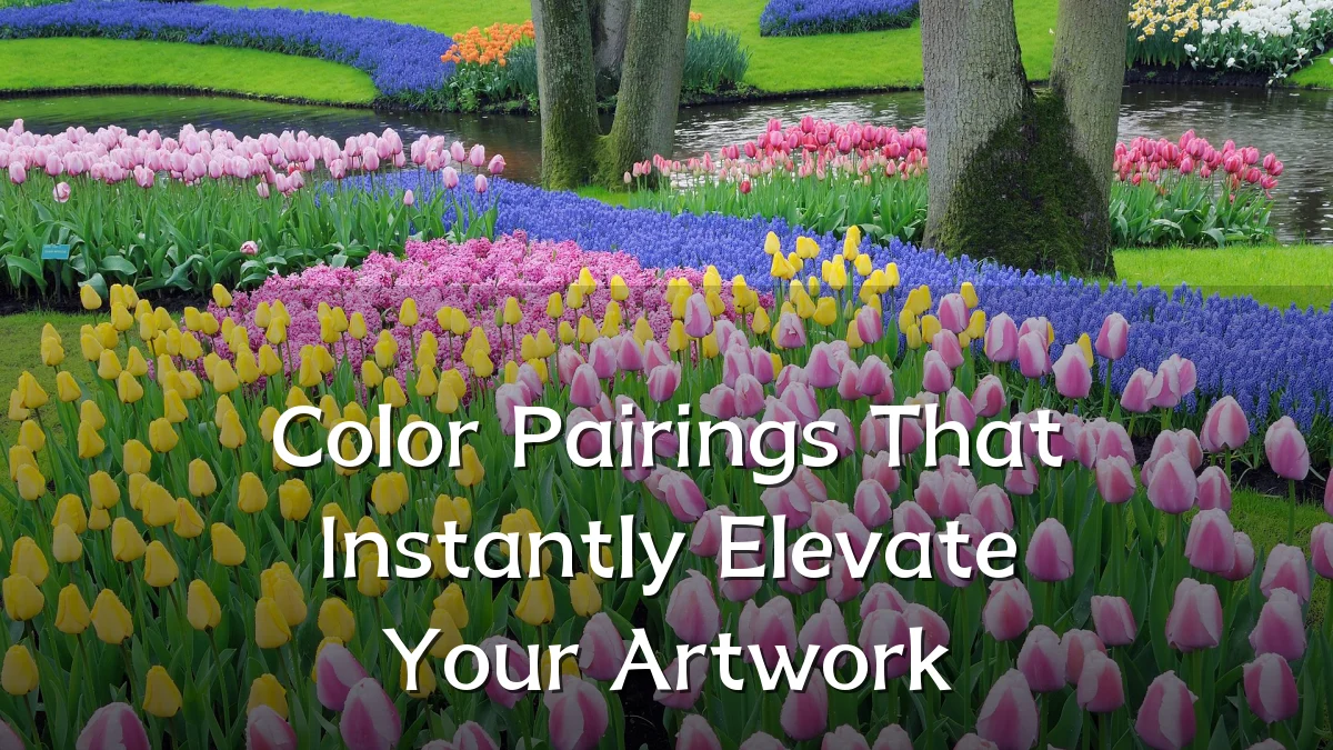
Recent Trends in Color Pairing
Contemporary designers and illustrators are moving away from conventional complementary pairs toward more nuanced combinations. Common themes in current portfolios include muted pastels paired with saturated accents, and warm neutrals broken by unexpected cool highlights. The shift is driven partly by digital-native workflows, where layered transparency and gradients reward pairings that read clearly on screens.
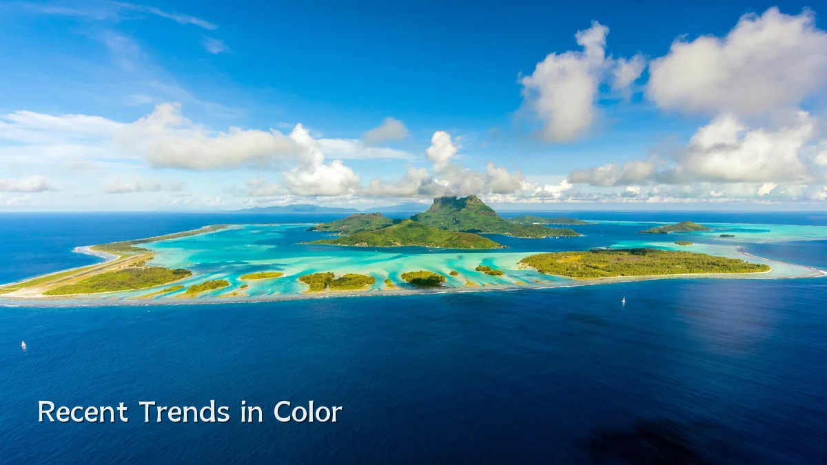
- Earthy duos, such as olive with burnt orange, appear frequently in branding for lifestyle and wellness clients.
- “Muted neon” pairings, like dusty lavender with electric lime, add energy without the harshness of full-saturation neon.
- Monochrome pairings built from tint, tone, and shade are gaining traction as a low-risk way to create depth.
Background: Why the Right Pairing Matters
The effectiveness of a color pairing depends less on a formula and more on how the combination behaves in context. Value contrast, temperature, and the proportion of each color all influence whether a pairing feels intentional or accidental. Historically, analogous and complementary schemes served as reliable starting points. But contemporary work often combines those traditions with perceptual considerations, asking whether two colors create strong figure-ground separation or subtle spatial tension.
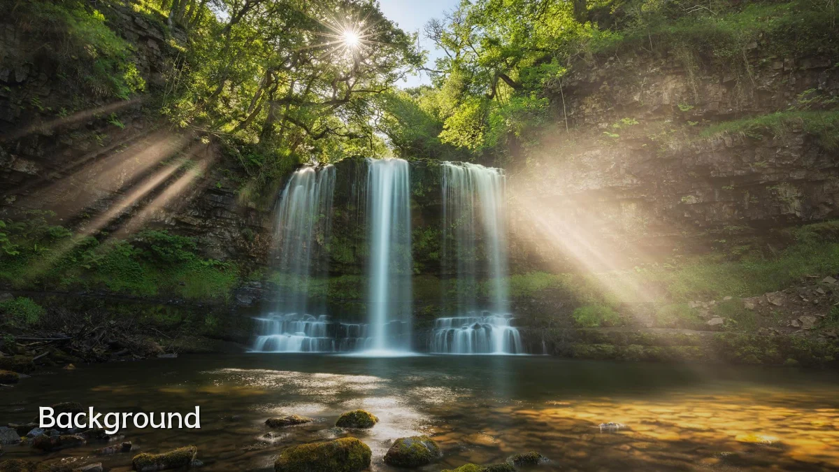
A practical approach for artists is to evaluate pairings under three filters: clarity, mood, and hierarchy. Clarity supports readability; mood sets the emotional tone; hierarchy guides the viewer’s attention. A pairing that fails on any one of these often needs adjustment through lightness, saturation, or the addition of a neutral buffer.
User Concerns and Common Pitfalls
Artists frequently express frustration when a palette that works in a swatch file loses its effect in the final piece. Common issues include color shifting between monitors, insufficient contrast for accessibility, and pairings that clash once texture or pattern is introduced. Another recurring concern is overreliance on simple complementary pairs, which can result in predictably harsh visuals when used at full saturation.
- Testing pairings in grayscale first helps identify whether value contrast is doing the heavy lifting.
- Adjusting one color’s saturation, rather than swapping the whole pair, often preserves intent while improving harmony.
- For print, artists should verify how translucent inks and paper tone alter the appearance of light pairings.
Likely Impact on Design Workflows
The practical effect of stronger color-pairing choices is faster iteration and fewer revisions. Teams that establish a clear color rationale tend to reach final assets more quickly, especially when the palette is tested early in mockups rather than late in production. In addition, the growth of generative tools and studio assistants means that pairing decisions will increasingly be suggested by software. That places more value on the artist’s ability to curate and judge, rather than simply generate, possible combinations.
For independent creators, the impact is visible in portfolio cohesion. A deliberate, repeatable approach to pairings gives a body of work a signature feel.
What to Watch Next
Watch for continued interest in adaptive palettes that shift within a single artwork based on user interaction or display conditions. Another emerging direction is the use of historic and regional color systems, allowing artists to ground their pairings in cultural reference rather than current fashion. Educational content, meanwhile, is becoming less about fixed rules and more about diagnostic guidelines that help artists identify why a pairing fails and how to fix it.
Expect future tooling to support these shifts with smarter contrast analysis, semantic color naming, and real-time suggestions that respect an artist’s existing palette. The underlying goal remains constant: pairings should create intention, not noise.